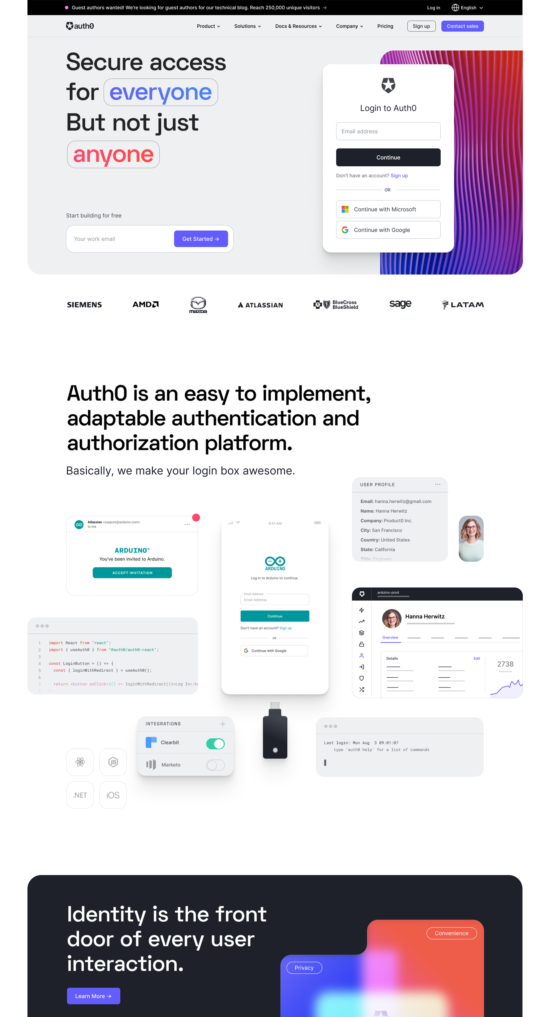
Creative leader and designer
Universal Login - Share image.png

auth0.com

auth0.com

As the brand design team, we owned the design and strategy for our marketing website, auth0.com, along with adjacent digital properties and microsites, and our design system. By having brand and digital closely aligned, we are able to experiment, innovate, and explore how our brand translates into web in a systematic approach.

Role: Sr. Manager, Brand Design
Team: Ceci Alvarez (Lead Brand Designer), Julian Leiss (Sr. Digital Designer),
Galen Milne-Hines (Sr. Digital Designer)


Creating a unified vision

After our brand evolution launch, we set out to redesign our .com site. While this would need to happen over time, we wanted to ensure we were working toward a singular cohesive vision. This meant mapping out our site architecture, and exploring how we might approach layouts, colors, hero viewports, and visual languages for different page categories.


Starting with the homepage

The first page we tackled in our redesign was the Homepage, as the first portal into our website. Since this change would be fairly radical, we ran the new design as a do-no-harm experiment. It resulted in increased conversions across the board, which gave us the thumbs up to run full steam ahead.


Following the home page, we then set out to update feature pages, company pages, a new careers hub, and more. Here are some of those designs.


Taking a systematic approach

In tandem to the new designs, our team began creating our web design system, called Quantum Web. This allows us to design and build more consistently and efficiently, but also ensures alignment with our product design system and various digital touch points.


Inclusivity and accessibility

An ongoing effort for our team is continuously doing better in accessibility and inclusivity, including within our digital properties. We performed an accessibility audit with Level Access for our .com property, and have been making continuously improvements to our site and design system based on the findings.

Updates thus far have been improvements such as alt text, color contrast, descriptive link text, ensuring all interactive functionality is operable with the keyboard, and more. In addition, we created an accessibility checklist for designers and engineers to follow as a starting point moving forward.


Where we are today

We are continuously updating our website and experimenting with new designs. With the Okta integration, we are looking into how we can bring the two properties closer together to create a unified user journey.